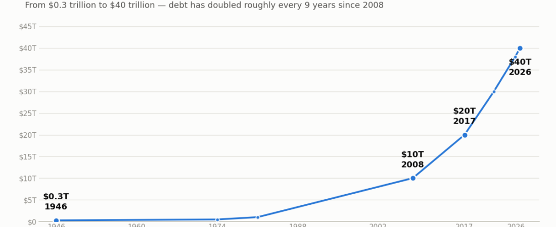
From debt-free in 1835 to $40 trillion today — what the pattern in the numbers says about where the U.S. national debt goes next.
By Sang Lee — Founder and Editor of AssetCalculus | Published by AssetCalculus
The US National Debt in One Paragraph
The U.S. national debt crossed $40 trillion in August 2026 — up from $39 trillion just five months earlier, and from $38 trillion only ten months before that. There are a few standard ways to measure that against the size of the economy, and it matters which one you use: the IMF’s general government gross debt measure (a broad figure that includes federal, state, and local government debt and social security funds, while consolidating debt held within the general government sector) puts the U.S. around 126% of GDP; the narrower, federal-only gross federal debt series the U.S. Treasury tracks runs a bit lower; and debt held by the public (the measure the CBO uses, and the one comparable to historical benchmarks like the WWII peak) is closer to 100–101% of GDP in 2026. These are related but genuinely different yardsticks, not three ways of saying the same thing.
Divided across the population, the debt works out to about $119,575 for every U.S. citizen and $286,126 for every taxpayer, according to U.S. Debt Clock’s real-time calculation (not an official Treasury figure). None of this happened overnight, and none of it is really about any single president, party, or policy. It’s the visible result of a math problem that has been compounding, quite literally, for decades. This piece walks through how the U.S. got here, and — since this is a calculator site — what the underlying math actually shows.
A Short History of a Debt-Free Country
It’s easy to forget the U.S. was ever debt-free, but it happened once: in 1835–36, under President Andrew Jackson, the federal government paid off the entire national debt — the only time that has occurred since the country’s founding. It didn’t last. Wars are expensive, and every major conflict since has left a permanent mark on the debt level that peacetime never fully erases.
| Period | What happened | Gross Debt-to-GDP (approx.) |
|---|---|---|
| 1835–36 | National debt fully paid off under Andrew Jackson | 0% |
| 1946 | Post-WWII peak; wartime borrowing funded the largest mobilization in U.S. history | ~119% |
| 1974 | Lowest point of the postwar era, under Nixon, after three decades of growth and mild inflation eroding the debt’s real value | ~32% |
| 1981 | Debt crosses $1 trillion for the first time (took roughly 200 years) | — |
| 1980s | Debt rises sharply under Reagan-era tax cuts and higher defense spending | — |
| 1990s | One of only two periods since 1974 where the ratio declined, helped by the dot-com boom and spending restraint | — |
| 2008 | Debt crosses $10 trillion amid the financial crisis and bank/auto bailouts | ~68% |
| 2017 | Debt crosses $20 trillion | ~102% |
| 2020 | COVID-19 relief spending produces a $3.3 trillion deficit in a single year — 16% of GDP, more than triple 2019’s | — |
| Feb 2022 | Debt crosses $30 trillion | ~120% |
| Oct 2025 | Debt crosses $38 trillion (the prior trillion was added in just 71 days) | ~122.6% |
| Mar 2026 | Debt crosses $39 trillion | — |
| Aug 2026 | Debt crosses $40 trillion | ~126%¹ |
A few things jump out. First, today’s broad gross-debt measures are above their WWII-era levels, although the exact ratio depends on the debt definition used — but on the narrower “debt held by the public” measure that economists more often use for historical comparisons, the U.S. hasn’t quite crossed that line yet (more on that below). Second, the pace of new trillion-dollar milestones has been accelerating — which is really a story about compounding, not just spending.
Note: the 1946–2025 ratios above (per FRED’s “Federal Debt: Total Public Debt as Percent of GDP” series) use U.S. gross federal debt — the most consistent single measure available across this full 90-year span. The ¹2026 figure of ~126% is different: it’s the IMF’s “general government gross debt” estimate, a broader international measure that also folds in state and local debt, so it isn’t perfectly apples-to-apples with the federal-only figures in the rows above it — directionally consistent, but not the same yardstick. The “debt held by the public” measure — the one the CBO tracks and the one directly comparable to the WWII 106% record — is discussed separately below, since mixing any of these definitions understates or overstates the comparison depending on the year.
The Math Behind the US National Debt
Here’s the pattern that’s easy to miss in the headlines: the debt has now doubled twice in a row on almost exactly the same timeline.
- $10 trillion (2008) → $20 trillion (2017): 9 years
- $20 trillion (2017) → $40 trillion (2026): 9 years
That’s not a coincidence of rounding — it’s what a sustained compound growth rate looks like. If we run it through the Rule of 72 (the shortcut we’ve written about before: divide 72 by the annual growth rate to estimate the doubling time), a 9-year doubling period implies debt has been growing at roughly:
72 ÷ 9 years ≈ 8% per year — the Rule of 72 implies roughly an 8% annualized growth rate, sustained for nearly two decades. (The Rule of 72 is a quick approximation, not an exact CAGR formula — but in this case the actual compound annual growth rate over those two 9-year stretches works out to almost exactly the same number.)
That’s the same math that makes compound interest such a powerful force for a saver — except here it’s working in reverse, on a liability instead of an asset. If that 8% annual growth rate simply continued (not a forecast — just the same math applied forward), the debt would double roughly every 9 years going forward too:
| If the historical ~8%/year pace continued | Illustrative debt level |
|---|---|
| 2026 | $40 trillion (actual) |
| ~2035 | ~$80 trillion |
| ~2044 | ~$160 trillion |
To be clear, nobody — not the CBO, not the IMF — is projecting debt to literally keep doubling forever at this exact clip; growth rates like this typically slow or get interrupted by policy change, higher taxes, or a crisis. The table above isn’t a prediction. It’s an illustration of why a debt load that looks manageable at 5% GDP growth can look very different after a few compounding cycles, which is the same reason a savings account’s future value or a mortgage’s total interest cost can surprise people who only think in terms of the year-one number.
Why Interest Is Becoming the Real Story
The more urgent number for the next decade isn’t the $40 trillion balance itself — it’s what it costs to carry. Through the first ten months of fiscal year 2026, the federal government paid $931 billion just in interest, an 11% increase over the same period a year earlier, and full-year interest costs are on pace to cross $1 trillion for the first time. That already makes interest the third-largest line item in the federal budget, behind only Social Security and Medicare — ahead of defense.
The Congressional Budget Office projects net interest payments will total $16.2 trillion over the next decade, rising from roughly $1.0 trillion in 2026 to $2.1 trillion by 2036. As a share of GDP, interest costs are projected to hit 3.3% in 2026 — already above the prior post-WWII record set in 1991 — and climb toward 4.6% by 2036.
This is where compounding turns from an abstraction into a mechanical problem: when a government runs a deficit, it borrows to cover the gap — and if it’s also borrowing to cover the interest on debt it already owes, that interest starts generating more interest, the same way an unpaid credit card balance does. The math is identical to the compound interest examples we’ve run on savings accounts; the only difference is which side of the ledger you’re standing on.
Why the WWII Comparison Isn’t Quite Apples-to-Apples
On the “debt held by the public” measure — the one directly comparable across decades — the U.S. hasn’t technically broken its all-time record yet. That record was set at the end of World War II, when debt held by the public peaked near 106% of GDP, before falling to about 32% by 1974. Today’s level is around 100–101%, just below that mark.
The reason this isn’t especially reassuring: the CBO’s own February 2026 baseline projects the U.S. will surpass the WWII-era 106% record by fiscal year 2030 — just a few years out — and keep climbing to roughly 120% of GDP by 2036. Unlike 1946, when the ratio peaked and then reversed for three decades, nothing in the current baseline has this one turning back down. Two things made the 1946–1974 decline possible that don’t apply as cleanly today:
- Negative real interest rates, alongside growth and primary surpluses. IMF research on the postwar decline points to a combination of factors — low real interest rates (inflation running higher than bond yields, which shrank the debt’s real value even while the nominal balance stayed flat), strong economic growth, and periods of primary budget surplus. Reproducing that same combination today is a genuinely open question: today’s bond markets price in inflation expectations more actively than they did in the 1940s–50s, which is one reason (among several) that the “grow out of it” path may be harder to repeat, though not one any economist would call impossible.
- A shrinking, not growing, primary driver. WWII debt was overwhelmingly wartime spending — a one-time bulge that reversed the moment the war ended and military spending fell. Today’s largest and fastest-growing drivers are Social Security and Medicare, which are structural and demographic, not temporary. Some projections put the 30-year shortfall across those two programs alone at roughly $157 trillion.
That second point is also why “just cut spending” is more of a math problem than a political slogan. Discretionary spending — the part of the budget that isn’t Social Security, Medicare, interest, or other mandated programs — has already fallen from about 12% of GDP in the 1960s to roughly 6% today. Independent analysis (Brookings) has found that balancing the budget within a decade using only lower-priority spending cuts would require cutting all such programs by 36%; protecting Social Security and Medicare pushes the required cut on everything else to 69%; protecting veterans’ benefits and defense as well pushes it past 80–100% — i.e., past the point where it’s mathematically possible without also touching the big three.
What This Actually Means for You
This isn’t a column telling you what to do with your portfolio — that’s a decision for you and, if appropriate, a licensed financial advisor, and AssetCalculus doesn’t give personalized investment advice. But a few mathematical takeaways from the numbers above are worth having in the back of your mind as a saver or investor:
- Compounding cuts both ways. The same Rule of 72 logic that makes a savings account or index fund grow faster than intuition suggests is exactly what’s driving the debt and interest-cost trajectories above. Understanding the math on one side helps you understand it on the other.
- Government borrowing needs and Treasury yields are connected. A federal government that needs to issue more debt to cover a larger interest bill is, all else equal, competing for the same lending market that sets rates on everything from mortgages to CDs — part of why “higher for longer” has been a persistent theme.
- Inflation-adjusted thinking matters more, not less, in this environment. However this fiscal picture eventually gets resolved — spending cuts, tax changes, faster growth, or some inflation — it’s a reminder to evaluate any return, rate, or promise in real, after-inflation terms rather than the headline number alone.
The Bottom Line
The U.S. has been debt-free exactly once, in 1835. Since then, every major national event — wars, a financial crisis, a pandemic — has added a permanent layer to the balance, and for the last two decades, that balance has been doubling on a strikingly consistent roughly-9-year, roughly-8%-a-year cycle that the Rule of 72 predicts almost exactly. On the measure economists compare across history, debt held by the public is on track to break the WWII-era record by 2030 and keep rising — not peak and reverse the way it did last time.
Interest costs alone are close to $1 trillion a year and climbing toward $2.1 trillion within a decade, and the math on closing the gap with spending cuts alone doesn’t add up without touching Social Security, Medicare, or both. None of that requires a political opinion to understand — it’s arithmetic, and it’s the same compounding math this site uses to explain how savings grow, just running in the other direction.
Related Reading
- The Rule of 72 — the same shortcut used above to translate the debt’s doubling time into an implied annual growth rate.
- What Is Compound Interest? — the mechanism behind both a growing savings account and a growing interest bill.
- Where the U.S. Economy Stands in August 2026 — the current Fed rate, inflation, and savings-rate backdrop this debt load sits inside.
Official Sources and Assumptions
Current debt total and per-citizen/per-taxpayer figures are as of August 2026, per U.S. Treasury Fiscal Data and U.S. Debt Clock aggregated figures; the ~126%-of-GDP figure for 2026 is the IMF’s general government gross debt estimate specifically (a broader measure than the U.S. federal-only series used elsewhere in this piece — see note above the history table). Historical U.S. gross-federal-debt-to-GDP figures by milestone year (1946: ~119%; 2017: ~102%; Feb 2022: ~120%; Oct 2025: ~122.6%) are the FRED “Federal Debt: Total Public Debt as Percent of GDP” series (GFDEGDQ188S), cross-checked against PrimeRates’ and TheWorldData.com’s historical debt summaries and Wikipedia’s “National debt of the United States” and “History of the United States public debt”; the gross-vs-public distinction itself is confirmed against the Committee for a Responsible Federal Budget’s explainer.
Debt-held-by-the-public figures (100–101% of GDP in 2026, projected to surpass the WWII-era 106% record by FY2030 and reach 120% by FY2036) and net interest projections ($1.0 trillion in FY2026 rising to $2.1 trillion in FY2036, or 3.3% to 4.6% of GDP) are from the Congressional Budget Office’s February 2026 Budget and Economic Outlook executive summary directly, cross-checked against summaries from the Committee for a Responsible Federal Budget, the Bipartisan Policy Center, and the Peter G. Peterson Foundation’s monthly interest tracker. The Brookings Institution’s spending-cut-math figures are drawn from its analysis as reported by Fortune (May 2026). This article is for general informational and educational purposes only. It summarizes public fiscal and economic data and does not constitute, and should not be relied upon as, personalized financial, investment, tax, or legal advice.
August 27, 2026